Why HSL and HSV Fail at True Color Perception
Quick Answer
HSL and HSV feel intuitive because they turn color into three simple sliders: hue, saturation, and lightness or value. That is why they appear in many color pickers, design tools, and browser-based games. You choose a hue, adjust how colorful it feels, then make it lighter or darker.
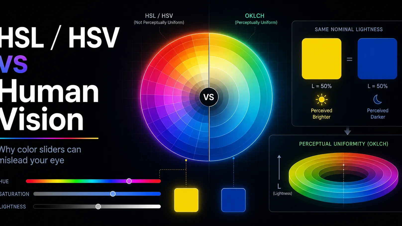
The problem is that these sliders are not perceptually uniform. In other words, equal numeric changes do not always look like equal visual changes to the human eye. A yellow and a blue can share the same HSL lightness value, yet the yellow may appear far brighter. A small hue shift in one part of the color wheel can feel obvious, while the same degree shift somewhere else may feel subtler. HSL/HSV saturation also does not directly equal perceived color intensity or chroma.
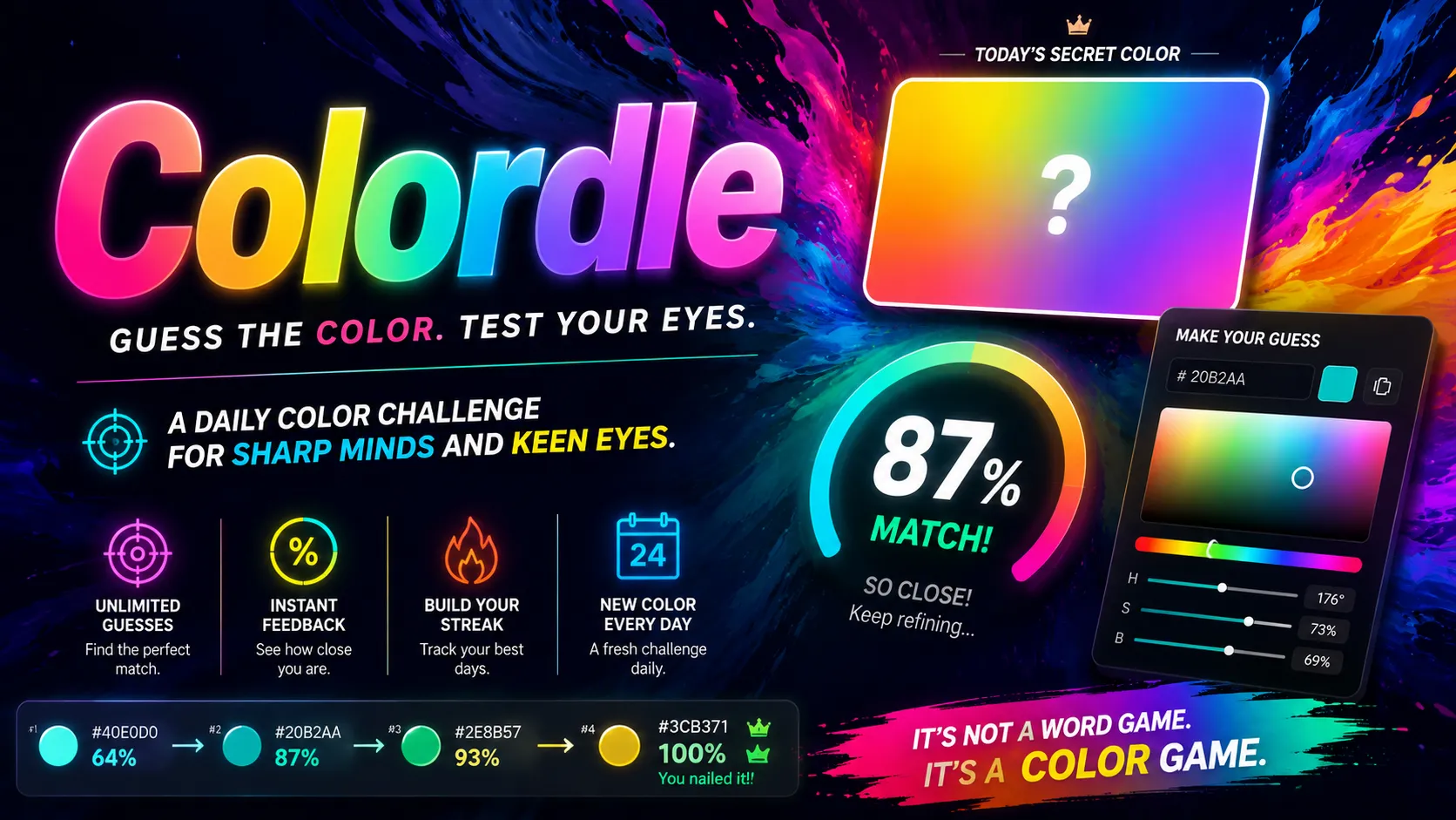
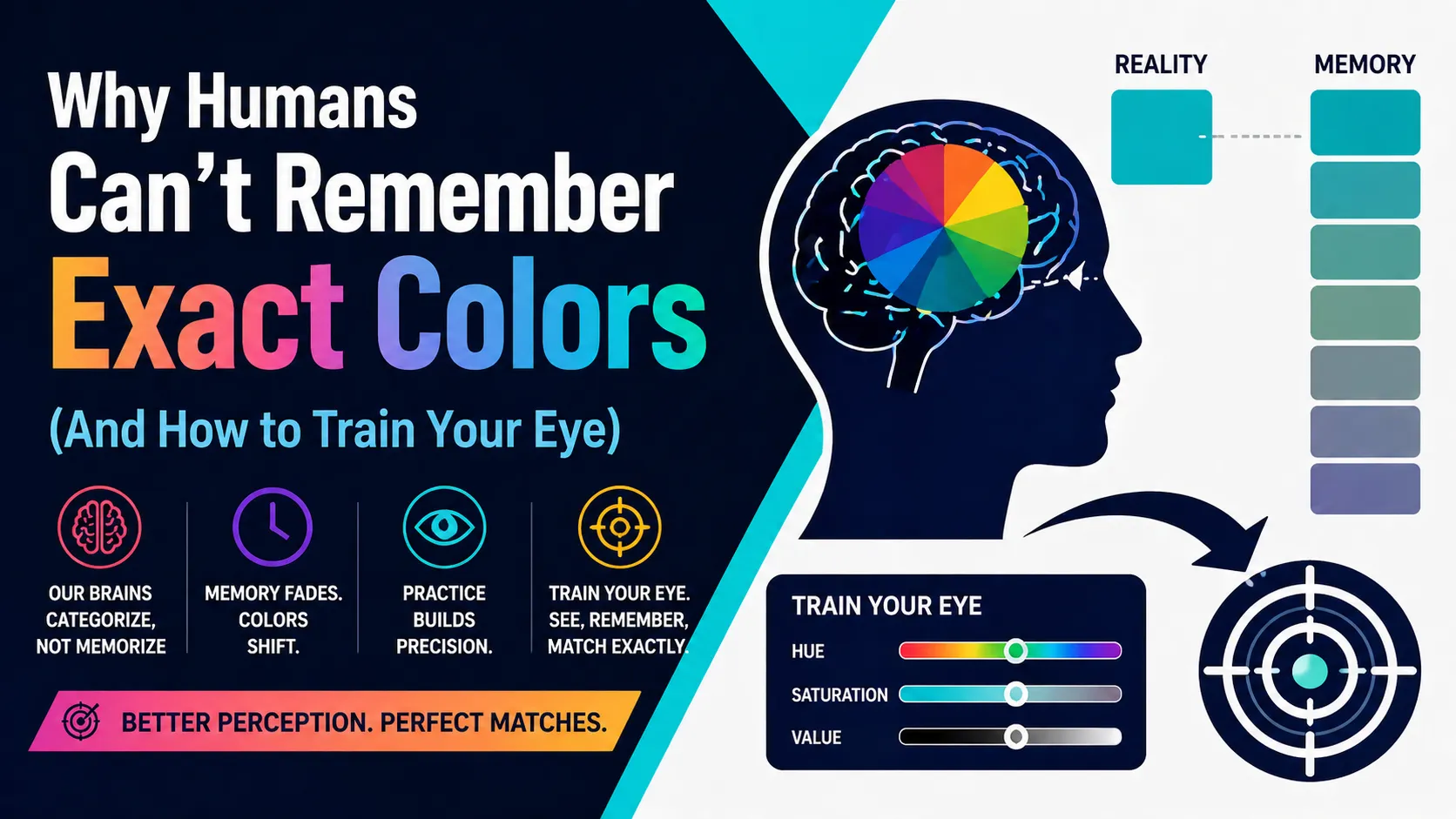
This matters in color memory games like Dialed, where players briefly see a target color and then try to recreate it from memory. If you rely only on slider numbers, the game can feel inconsistent or unfair. But once you understand that HSL and HSV are convenient interface models rather than true models of human vision, you can train your eye more effectively.
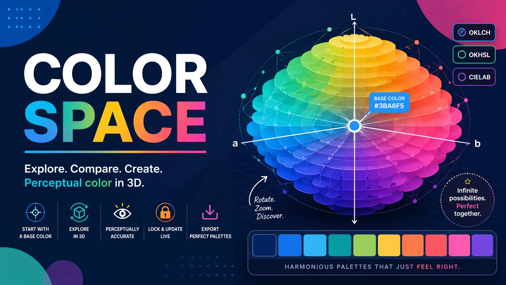
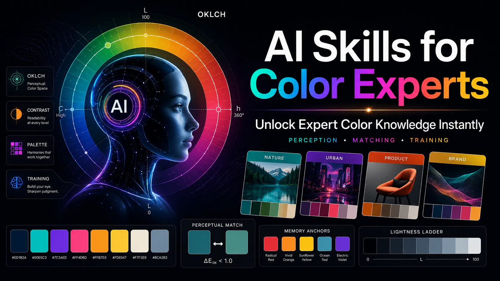
A better mental model is this: HSL and HSV are useful for picking colors, but not always reliable for judging how different two colors will look. Perceptual color spaces such as OKLCH are designed to make lightness, chroma, and hue behave more consistently with how humans perceive color. MDN defines OKLCH through lightness, chroma, and hue channels, while the CSS Color Module Level 4 discusses perceptual color spaces in the context of more accurate color mapping. (MDN Web Docs)
Why HSL and HSV Feel Easy but Mislead Your Eye
HSL and HSV became popular because they are simple transformations of RGB. They make color easier to control than raw red, green, and blue numbers. Instead of asking users to mix three light channels, they offer a more familiar structure:
- Hue: What color family is it?
- Saturation: How colorful is it?
- Lightness or Value: How light, dark, or bright does it seem?
For quick design work, this is convenient. You can drag a hue slider from red to orange, lower saturation to make a color calmer, or adjust lightness/value to create variants.
But convenience is not the same as perceptual accuracy. HSL and HSV are based on geometry inside the RGB color cube, not on how the human visual system actually judges color differences. The HSL/HSV model is widely described as trading perceptual relevance for computational simplicity. (wikipedia)
That mismatch is why two colors can look very different even when their HSL or HSV values appear mathematically similar.
The Core Problem: HSL Lightness Is Not Perceived Brightness
One of the biggest traps is the word lightness.
In HSL, lightness is calculated from RGB channel values. It is not the same thing as perceived brightness. Human eyes are much more sensitive to some wavelengths than others, especially around green and yellow, and less sensitive to deep blue. As a result, two colors with the same HSL lightness can appear very different.
For example:
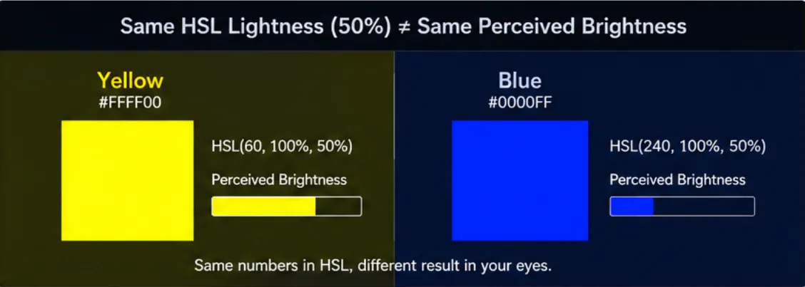
- Pure yellow
#FFFF00has HSL lightness of 50%. - Pure blue
#0000FFalso has HSL lightness of 50%. - But visually, yellow appears much brighter than blue.
That does not mean your eyes are wrong. It means HSL lightness is not designed to represent human-perceived brightness. OKLCH addresses this more directly by using a lightness channel intended to behave more consistently with visual perception. (evilmartians.com)
For a game like Dialed, this matters because a player may remember a color as “medium bright,” then struggle to recreate it with HSL/HSV sliders. The slider value may look correct, but the perceived result can still feel off.
Hue Angles Are Not Visually Equal
Hue also creates hidden problems.
In HSL and HSV, hue is usually shown as a neat 0–360° circle. Red sits near 0°, yellow around 60°, green around 120°, cyan around 180°, blue around 240°, and magenta around 300°. That structure looks balanced, but the human eye does not perceive every equal angle shift as an equal color difference.
A 20° movement in one part of the hue wheel may feel like a strong change. A 20° movement somewhere else may feel more modest. This is especially noticeable when you try to match colors from memory. You may overshoot reds, purples, or blues because the hue slider does not match your subjective sense of distance.
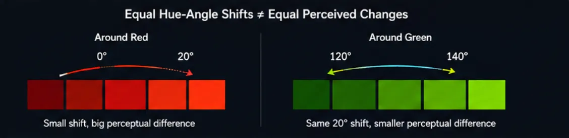
The important point is not that one specific hue range is always “harder.” The more accurate takeaway is:
Equal hue-angle changes in HSL/HSV do not guarantee equal perceived color changes.
That is why color matching can feel slippery. The wheel looks mathematically smooth, but your perception is uneven.
Saturation Is Not the Same as Chroma
Another common mistake is treating saturation as if it means “how vivid the color looks.”
In HSL and HSV, saturation is a mathematical relationship within the model. It describes how far the color is from a neutral gray relative to that model’s structure. But perceived vividness depends on more than saturation alone. It also depends on hue, brightness, contrast, surrounding colors, display gamut, and the color space being used.
A dark blue can be set to 100% saturation and still look muted. A bright yellow with lower saturation may still feel visually intense. This is because saturation in HSL/HSV is not the same as perceived chroma.
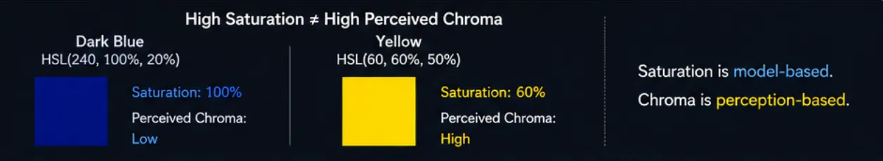
OKLCH makes this distinction clearer:
- L = perceived lightness
- C = chroma, or perceived color intensity
- H = hue angle
MDN describes OKLCH as using lightness, chroma, and hue channels, which makes it more aligned with how designers often want to reason about color. (MDN Web Docs)
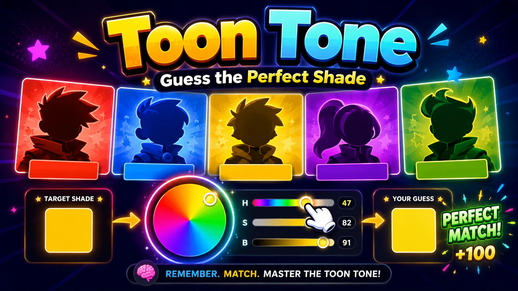
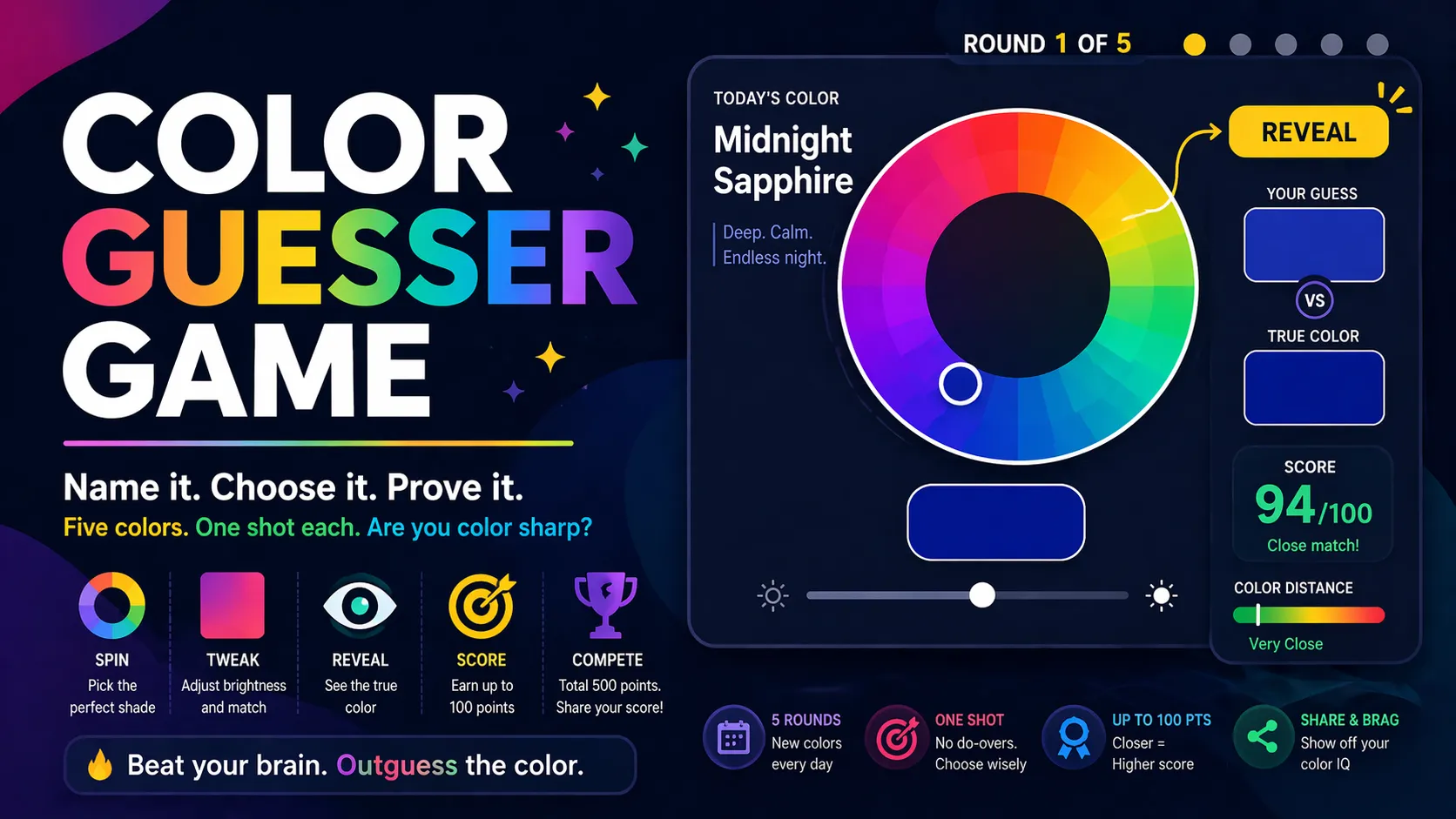
Why This Matters in Dialed and Other Color Memory Games
Dialed is not just a color picker test. It is a test of visual memory.
You briefly see a target shade, then you must reconstruct it. The challenge is not only remembering “red,” “blue,” or “green.” You have to remember:
- the hue family,
- the perceived brightness,
- the vividness or dullness,
- the warmth or coolness,
- the relationship between color and background,
- and how the target felt as a whole.
HSL/HSV can make this harder because the sliders may encourage you to think numerically instead of perceptually. You might remember a color as “around 50% lightness,” but that number behaves differently for yellow, blue, teal, or purple.
This is why color memory games can feel strangely difficult. Players are not only fighting memory fade. They are also fighting the mismatch between color picker geometry and human color perception.
Practical Example: Yellow vs Blue
Consider these two colors:
- Yellow:
#FFFF00 - Blue:
#0000FF
In HSL, both can have 50% lightness. On paper, that looks balanced. On screen, they do not feel balanced at all. Yellow appears much brighter and more energetic, while blue appears darker and visually heavier.
This is one of the clearest examples of why HSL lightness should not be treated as true perceptual brightness.
A player trying to recreate yellow in Dialed may need to think, “This color felt bright and luminous,” not merely, “This was around 50% lightness.” A player trying to recreate blue may need to compensate for the fact that blue often appears darker at similar slider values.
Practical Example: Saturated but Still Muted
Now consider a deep blue or dark teal. In HSV, it may have:
- high saturation,
- low value,
- strong hue identity.
Yet visually, it may still feel calm, muted, or heavy because its brightness is low. A full-saturation dark color does not necessarily look vivid in the way players expect.
This is where the difference between saturation and chroma becomes important. Saturation is model-specific. Chroma is closer to the perceived strength of the color.
For color matching, this means you should not ask only:
“Is the saturation high?”
You should also ask:
“Does the color actually feel vivid, or does it only have strong color information inside a dark shade?”
That question trains your eye better than memorizing slider values.
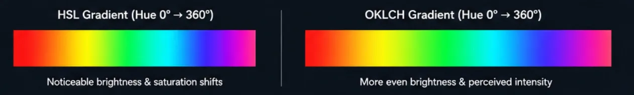
Why OKLCH Is a Better Mental Model
OKLCH is not magic, and it is not perfect. No color model fully captures every condition of human vision. But OKLCH is designed to be more perceptually uniform than RGB, HSL, or HSV. That means equal changes in OKLCH values tend to produce more consistent visual changes. The original Oklab model was designed to better predict perceived lightness, chroma, and hue, while still being practical for image processing and interface use. (bottosson.github.io)
For designers, this makes OKLCH useful for:
- creating smoother gradients,
- building color palettes with consistent lightness,
- adjusting hue without accidentally changing perceived brightness too much,
- creating accessible themes,
- managing wide-gamut colors,
- and thinking about color in a more human-centered way.
For players, the lesson is simpler:
Train your eye around perceived lightness, chroma, and hue—not just HSL or HSV numbers.
Common Mistakes When Matching Colors
Mistake 1: Trusting HSL Lightness Too Much
A value of 50% lightness does not mean “visually halfway bright.” It only means halfway according to the HSL formula.
Better approach:
Ask whether the color feels bright, dim, glowing, heavy, pale, or dense.
Mistake 2: Treating Saturation as Vividness
A color can be mathematically saturated but visually subdued. This happens often with dark blues, purples, and teals.
Better approach:
Judge how strongly the color stands out to your eye, not just how high the saturation slider is.
Mistake 3: Moving Hue by Equal Degrees
A 10° or 20° hue shift does not always feel equally large across the color wheel.
Better approach:
Look for color-family changes: red to orange-red, blue to violet-blue, teal to green-cyan. Think in visual neighborhoods, not just degrees.
Mistake 4: Ignoring Background Context
The same color can look different on white, black, gray, or highly saturated backgrounds. Human color perception is contextual.
Better approach:
When matching a color, pay attention to the background and surrounding contrast. A color that looks bright on black may feel weaker on white.
Mistake 5: Memorizing Numbers Instead of Visual Impressions
In Dialed, the target disappears quickly. If you try to memorize exact HSV or HSL values, you will often fail.
Better approach:
Remember the impression: “warm muted orange,” “electric cyan,” “dusty purple,” “deep green-blue,” or “pale lemon yellow.”
How To Train Your Eye for Better Color Accuracy
1. Separate Hue, Lightness, and Chroma in Your Mind
When you see the target color, quickly ask:
- What hue family is it?
- How bright does it feel?
- How vivid or muted does it feel?
Do not jump straight to numbers. Build a visual diagnosis first.
2. Use Grayscale Thinking
One useful trick is to imagine the color without hue. Ask:
“If this were grayscale, how light or dark would it be?”
This helps you isolate perceived lightness from color identity. It is especially useful for yellows, blues, and purples, where HSL/HSV values can be misleading.
3. Build Color Anchors
Create mental reference points:
#FF0000= pure red#FFFF00= pure yellow#0000FF= pure blue#008080= teal#FFEA00= vivid warm yellow#800080= classic purple
Then compare new colors against those anchors. Is the target warmer than teal? Duller than pure blue? Lighter than purple? Less intense than yellow?
Anchors make color memory more stable.
4. Practice One Hue Range at a Time
Instead of jumping across the whole color wheel, practice narrow ranges:
- blues from 195° to 260°,
- greens from 100° to 160°,
- reds from 350° to 20°,
- purples from 260° to 310°.
This helps you feel how hue changes behave inside one family.
5. Review Your Mistakes by Category
After each guess, do not just ask, “Was I close?”
Ask:
- Was my hue too warm or too cool?
- Was my color too bright or too dark?
- Was it too vivid or too gray?
- Did I confuse saturation with brightness?
- Did the background make the color feel different?
This turns every wrong guess into useful training.
Final Take
HSL and HSV are excellent interface tools, but they are not accurate maps of human color perception. They make colors easy to adjust, yet they can mislead you when you need precision. Their lightness values are not true perceived brightness. Their hue angles are not visually equal. Their saturation values do not always match perceived chroma.
That is why color matching games like Dialed are harder than they first appear. You are not simply moving sliders. You are translating a short-lived visual memory into a color model that does not perfectly match how your eyes work.
The best way to improve is to stop treating HSL and HSV numbers as truth. Use them as controls, not as perception. Train yourself to judge colors by perceived lightness, chroma, and hue. Perceptual models like OKLCH offer a better framework because they are designed around more consistent visual differences, not just convenient RGB math.
In the end, the goal is not to become a better slider operator. The goal is to build a sharper eye.
Continue Reading
More guides, comparisons, and explainers related to the same games and topics.
Related Games
Browse games connected to the ideas, mechanics, or categories covered in this article.